
E-Learn Knowledge Base
List of Mathematical function in Math Module
Here is the list of all mathematical functions in math module, you can use them when you need it in program:
| Function Name | Description |
|---|---|
| ceil(x) | Returns the smallest integral value greater than the number |
| copysign(x, y) | Returns the number with the value of ‘x’ but with the sign of ‘y’ |
| fabs(x) | Returns the absolute value of the number |
| factorial(x) | Returns the factorial of the number |
| floor(x) | Returns the greatest integral value smaller than the number |
| gcd(x, y) | Compute the greatest common divisor of 2 numbers |
| fmod(x, y) | Returns the remainder when x is divided by y |
| frexp(x) | Returns the mantissa and exponent of x as the pair (m, e) |
| fsum(iterable) | Returns the precise floating-point value of sum of elements in an iterable |
| isfinite(x) | Check whether the value is neither infinity not Nan |
| isinf(x) | Check whether the value is infinity or not |
| isnan(x) | Returns true if the number is “nan” else returns false |
| ldexp(x, i) | Returns x * (2**i) |
| modf(x) | Returns the fractional and integer parts of x |
| trunc(x) | Returns the truncated integer value of x |
| exp(x) | Returns the value of e raised to the power x(e**x) |
| expm1(x) | Returns the value of e raised to the power a (x-1) |
| log(x[, b]) | Returns the logarithmic value of a with base b |
| log1p(x) | Returns the natural logarithmic value of 1+x |
| log2(x) | Computes value of log a with base 2 |
| log10(x) | Computes value of log a with base 10 |
| pow(x, y) | Compute value of x raised to the power y (x**y) |
| sqrt(x) | Returns the square root of the number |
| acos(x) | Returns the arc cosine of value passed as argument |
| asin(x) | Returns the arc sine of value passed as argument |
| atan(x) | Returns the arc tangent of value passed as argument |
| atan2(y, x) | Returns atan(y / x) |
| cos(x) | Returns the cosine of value passed as argument |
| hypot(x, y) | Returns the hypotenuse of the values passed in arguments |
| sin(x) | Returns the sine of value passed as argument |
| tan(x) | Returns the tangent of the value passed as argument |
| degrees(x) | Convert argument value from radians to degrees |
| radians(x) | Convert argument value from degrees to radians |
| acosh(x) | Returns the inverse hyperbolic cosine of value passed as argument |
| asinh(x) | Returns the inverse hyperbolic sine of value passed as argument |
| atanh(x) | Returns the inverse hyperbolic tangent of value passed as argument |
| cosh(x) | Returns the hyperbolic cosine of value passed as argument |
| sinh(x) | Returns the hyperbolic sine of value passed as argument |
| tanh(x) | Returns the hyperbolic tangent of value passed as argument |
| erf(x) | Returns the error function at x |
| erfc(x) | Returns the complementary error function at x |
| gamma(x) | Return the gamma function of the argument |
| lgamma(x) | Return the natural log of the absolute value of the gamma function |
Register for this course: Enrol Now
Comparison Operators in Python
Python operators can be used with various data types, including numbers, strings, boolean and more. In Python, comparison operators are used to compare the values of two operands (elements being compared). When comparing strings, the comparison is based on the alphabetical order of their characters (lexicographic order).
Be cautious when comparing floating-point numbers due to potential precision issues. Consider using a small tolerance value for comparisons instead of strict equality.
Now let's see the comparison operators in Python one by one.
| Operator | Description | Syntax |
|---|---|---|
| > | Greater than: True if the left operand is greater than the right | x > y |
| < | Less than: True if the left operand is less than the right | x < y |
| == | Equal to: True if both operands are equal | x == y |
| != | Not equal to: True if operands are not equal | x != y |
| >= | Greater than or equal to: True if the left operand is greater than or equal to the right | x >= y |
| <= | Less than or equal to: True if the left operand is less than or equal to the right | x <= y |
Python Equality Operators a == b
The Equal to Operator is also known as the Equality Operator in Python, as it is used to check for equality. It returns True if both the operands are equal i.e. if both the left and the right operands are equal to each other. Otherwise, it returns False.
Example: In this code, we have three variables 'a', 'b' and 'c' and assigned them with some integer value. Then we have used equal to operator to check if the variables are equal to each other.
Python
a = 9 b = 5 c = 9 # Output print(a == b) print(a == c)
Output:
False
True
Inequality Operators a != b
The Not Equal To Operator returns True if both the operands are not equal and returns False if both the operands are equal.
Example: In this code, we have three variables 'a', 'b' and 'c' and assigned them with some integer value. Then we have used equal to operator to check if the variables are equal to each other.
Python
a = 9 b = 5 c = 9 # Output print(a != b) print(a != c)
Output:
True
False
Greater than Sign a > b
The Greater Than Operator returns True if the left operand is greater than the right operand otherwise returns False.
Example: In this code, we have two variables 'a' and 'b' and assigned them with some integer value. Then we have used greater than operator to check if a variable is greater than the other.
Python
a = 9 b = 5 # Output print(a > b) print(b > a)
Output:
True
False
Less than Sign a < b
The Less Than Operator returns True if the left operand is less than the right operand otherwise it returns False.
Example: In this code, we have two variables 'a' and 'b' and assigned them with some integer value. Then we have used less than operator to check if a variable is less than the other.
Python
a = 9 b = 5 # Output print(a < b) print(b < a)
Output:
False
True
Greater than or Equal to Sign x >= y
The Greater Than or Equal To Operator returns True if the left operand is greater than or equal to the right operand, else it will return False.
Example: In this code, we have three variables 'a', 'b' and 'c' and assigned them with some integer value. Then we have used greater than or equal to operator to check if a variable is greater than or equal to the other.
Python
a = 9 b = 5 c = 9 # Output print(a >= b) print(a >= c) print(b >= a)
Output:
True
True
False
Less than or Equal to Sign x <= y
The Less Than or Equal To Operator returns True if the left operand is less than or equal to the right operand.
Example: In this code, we have three variables 'a', 'b' and 'c' and assigned them with some integer value. Then we have used less than or equal to operator to check if a variable is less than or equal to the other.
Python
a = 9 b = 5 c = 9 # Output print(a <= b) print(a <= c) print(b <= a)
Output:
False
True
True
Chaining Comparison Operators
In Python, we can use the chaining comparison operators to check multiple conditions in a single expression. One simple way of solving multiple conditions is by using Logical Operators. But in chaining comparison operators method, we can achieve this without any other operator.
Syntax: a op1 b op2 c
Example: In this code we have a variable 'a' which is assigned some integer value. We have used the chaining comparison operators method to compare the the value of 'a' with multiple conditions in a single expression.
Python
a = 5 # chaining comparison operators print(1 < a < 10) print(10 > a <= 9) print(5 != a > 4) print(a < 10 < a*10 == 50)
Output:
True
True
False
True
Authors: T. C. Okenna
Register for this course: Enrol Now
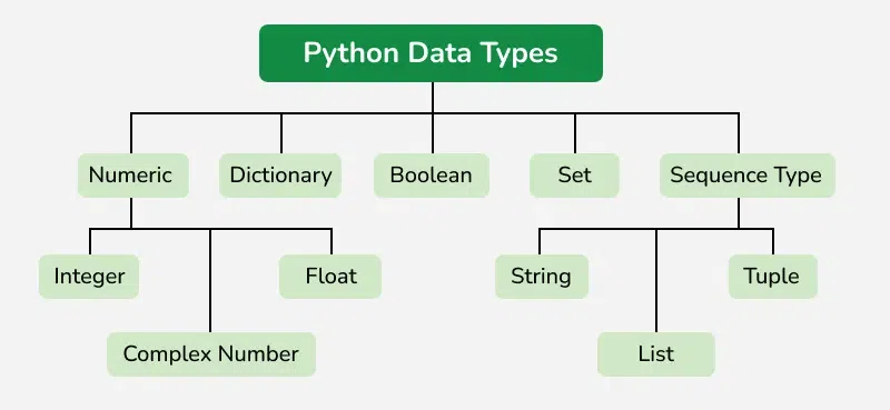
Python Data types are the classification or categorization of data items. It represents the kind of value that tells what operations can be performed on a particular data. Since everything is an object in Python programming, Python data types are classes and variables are instances (objects) of these classes. The following are the standard or built-in data types in Python:
- Numeric - int, float, complex
- Sequence Type - string, list, tuple
- Mapping Type - dict
- Boolean - bool
- Set Type - set, frozenset
- Binary Types - bytes, bytearray, memoryview
This code assigns variable 'x' different values of few Python data types - int, float, list, tuple and string. Each assignment replaces the previous value, making 'x' take on the data type and value of the most recent assignment.
# int, float, string, list and set x = 50 x = 60.5 x = "Hello World" x = ["geeks", "for", "geeks"] x = ("geeks", "for", "geeks")
1. Numeric Data Types in Python
The numeric data type in Python represents the data that has a numeric value. A numeric value can be an integer, a floating number, or even a complex number. These values are defined as Python int, Python float and Python complex classes in Python.
- Integers - This value is represented by int class. It contains positive or negative whole numbers (without fractions or decimals). In Python, there is no limit to how long an integer value can be.
- Float - This value is represented by the float class. It is a real number with a floating-point representation. It is specified by a decimal point. Optionally, the character e or E followed by a positive or negative integer may be appended to specify scientific notation.
- Complex Numbers - A complex number is represented by a complex class. It is specified as (real part) + (imaginary part)j . For example - 2+3j
a = 5
print(type(a))
b = 5.0
print(type(b))
c = 2 + 4j
print(type(c))
Output
<class 'int'>
<class 'float'>
<class 'complex'>
2. Sequence Data Types in Python
The sequence Data Type in Python is the ordered collection of similar or different Python data types. Sequences allow storing of multiple values in an organized and efficient fashion. There are several sequence data types of Python:
- Python String
- Python List
- Python Tuple
String Data Type
Python Strings are arrays of bytes representing Unicode characters. In Python, there is no character data type Python, a character is a string of length one. It is represented by str class.
Strings in Python can be created using single quotes, double quotes or even triple quotes. We can access individual characters of a String using index.
s = 'Welcome to the Geeks World'
print(s)
# check data type
print(type(s))
# access string with index
print(s[1])
print(s[2])
print(s[-1])
Output
Welcome to the Geeks World
<class 'str'>
e
l
d
List Data Type
Lists are just like arrays, declared in other languages which is an ordered collection of data. It is very flexible as the items in a list do not need to be of the same type.
Creating a List in Python
Lists in Python can be created by just placing the sequence inside the square brackets[].
# Empty list
a = []
# list with int values
a = [1, 2, 3]
print(a)
# list with mixed int and string
b = ["Geeks", "For", "Geeks", 4, 5]
print(b)
Output
[1, 2, 3]
['Geeks', 'For', 'Geeks', 4, 5]
Access List Items
In order to access the list items refer to the index number. In Python, negative sequence indexes represent positions from the end of the array. Instead of having to compute the offset as in List[len(List)-3], it is enough to just write List[-3]. Negative indexing means beginning from the end, -1 refers to the last item, -2 refers to the second-last item, etc.
a = ["Geeks", "For", "Geeks"]
print("Accessing element from the list")
print(a[0])
print(a[2])
print("Accessing element using negative indexing")
print(a[-1])
print(a[-3])
Output
Accessing element from the list
Geeks
Geeks
Accessing element using negative indexing
Geeks
Geeks
Tuple Data Type
Just like a list, a tuple is also an ordered collection of Python objects. The only difference between a tuple and a list is that tuples are immutable. Tuples cannot be modified after it is created.
Creating a Tuple in Python
In Python Data Types, tuples are created by placing a sequence of values separated by a ‘comma’ with or without the use of parentheses for grouping the data sequence. Tuples can contain any number of elements and of any datatype (like strings, integers, lists, etc.).
Note: Tuples can also be created with a single element, but it is a bit tricky. Having one element in the parentheses is not sufficient, there must be a trailing ‘comma’ to make it a tuple.
# initiate empty tuple
tup1 = ()
tup2 = ('Geeks', 'For')
print("
Tuple with the use of String: ", tup2)
Output
Tuple with the use of String: ('Geeks', 'For')
Note - The creation of a Python tuple without the use of parentheses is known as Tuple Packing.
Access Tuple Items
In order to access the tuple items refer to the index number. Use the index operator [ ] to access an item in a tuple.
tup1 = tuple([1, 2, 3, 4, 5])
# access tuple items
print(tup1[0])
print(tup1[-1])
print(tup1[-3])
Output
1
5
3
3. Boolean Data Type in Python
Python Data type with one of the two built-in values, True or False. Boolean objects that are equal to True are truthy (true), and those equal to False are falsy (false). However non-Boolean objects can be evaluated in a Boolean context as well and determined to be true or false. It is denoted by the class bool.
Example: The first two lines will print the type of the boolean values True and False, which is <class 'bool'>. The third line will cause an error, because true is not a valid keyword in Python. Python is case-sensitive, which means it distinguishes between uppercase and lowercase letters.
print(type(True))
print(type(False))
print(type(true))
Output:
<class 'bool'>
<class 'bool'>
Traceback (most recent call last):
 File "/home/7e8862763fb66153d70824099d4f5fb7.py", line 8, in
 print(type(true))
NameError: name 'true' is not defined
4. Set Data Type in Python
In Python Data Types, Set is an unordered collection of data types that is iterable, mutable, and has no duplicate elements. The order of elements in a set is undefined though it may consist of various elements.
Create a Set in Python
Sets can be created by using the built-in set() function with an iterable object or a sequence by placing the sequence inside curly braces, separated by a ‘comma’. The type of elements in a set need not be the same, various mixed-up data type values can also be passed to the set.
Example: The code is an example of how to create sets using different types of values, such as strings , lists , and mixed values
# initializing empty set
s1 = set()
s1 = set("GeeksForGeeks")
print("Set with the use of String: ", s1)
s2 = set(["Geeks", "For", "Geeks"])
print("Set with the use of List: ", s2)
Output
Set with the use of String:  {'s', 'o', 'F', 'G', 'e', 'k', 'r'}
Set with the use of List:  {'Geeks', 'For'}
Access Set Items
Set items cannot be accessed by referring to an index, since sets are unordered the items have no index. But we can loop through the set items using a for loop, or ask if a specified value is present in a set, by using the in the keyword.
set1 = set(["Geeks", "For", "Geeks"])
print(set1)
# loop through set
for i in set1:
print(i, end=" ")
# check if item exist in set
print("Geeks" in set1)
Output
{'Geeks', 'For'}
Geeks For True
5. Dictionary Data Type
A dictionary in Python is a collection of data values, used to store data values like a map, unlike other Python Data Types that hold only a single value as an element, a Dictionary holds a key: value pair. Key-value is provided in the dictionary to make it more optimized. Each key-value pair in a Dictionary is separated by a colon : , whereas each key is separated by a ‘comma’.
Create a Dictionary in Python
Values in a dictionary can be of any datatype and can be duplicated, whereas keys can’t be repeated and must be immutable. The dictionary can also be created by the built-in function dict().
Note - Dictionary keys are case sensitive, the same name but different cases of Key will be treated distinctly.
# initialize empty dictionary
d = {}
d = {1: 'Geeks', 2: 'For', 3: 'Geeks'}
print(d)
# creating dictionary using dict() constructor
d1 = dict({1: 'Geeks', 2: 'For', 3: 'Geeks'})
print(d1)
Output
{1: 'Geeks', 2: 'For', 3: 'Geeks'}
{1: 'Geeks', 2: 'For', 3: 'Geeks'}
Accessing Key-value in Dictionary
In order to access the items of a dictionary refer to its key name. Key can be used inside square brackets. Using get() method we can access the dictionary elements.
d = {1: 'Geeks', 'name': 'For', 3: 'Geeks'}
# Accessing an element using key
print(d['name'])
# Accessing a element using get
print(d.get(3))
Output
For
Geeks
Python Data Type Exercise Questions
Below are two exercise questions on Python Data Types. We have covered list operation and tuple operation in these exercise questions. For more exercises on Python data types visit the page mentioned below.
Q1. Code to implement basic list operations
fruits = ["apple", "banana", "orange"]
print(fruits)
fruits.append("grape")
print(fruits)
fruits.remove("orange")
print(fruits)
Output
['apple', 'banana', 'orange']
['apple', 'banana', 'orange', 'grape']
['apple', 'banana', 'grape']
Q2. Code to implement basic tuple operation
coordinates = (3, 5)
print(coordinates)
print("X-coordinate:", coordinates[0])
print("Y-coordinate:", coordinates[1])
Output
(3, 5)
X-coordinate: 3
Y-coordinate: 5
Authors: T. C. Okenna, GeeksforGeeks
Register for this course: Enrol Now
Dot Product
The Dot Product, or the inner product or scalar product, is a fundamental operation in vector algebra that combines two vectors to produce a scalar quantity. This operation is essential in various fields, including physics, engineering, and computer graphics, due to its ability to measure the similarity between two vectors. The dot product can provide information about the angle between vectors, the projection of one vector onto another, and more.
1.0Dot and Cross Product of a Vector
What is the Dot Product?
The Dot Product ⋅b is calculated as the sum of the products of corresponding components of two vectors.
The dot product is also known as the inner product or the scalar product and reads “a dot b”.
If =x1i^+y1j^+z1k^ and =x2i^+y2j^+z1k^ then dot product is ⋅b=x1x2+y1y1+z1z2.
The scalar product is useful for determining the angle between two vectors.
Geometric Interpretation
Geometrically, the dot product can be interpreted as:
⋅B=∣A∥B∣cos(θ)
Where are the magnitudes of the vectors, and is the angle between them.
What is the Cross Product?
Given two vectors =(A1, A2, A3) and =(B1, B2, B3), the cross product ×B is defined as:
×B=(A2 B3−A3 B2, A3 B1−A1 B3, A1 B2−A2 B1)
This resultant vector is orthogonal to both .
Geometric Interpretation
The magnitude of the cross product is given by: ×B∣=∣A∥B∣sin(θ) where and are the magnitudes of vectors and , and θ is the angle between them determines the direction of the resulting vector, following the right-hand rule.
2.0Dot Product Formula
For two vectors =(A1, A2, A3) and =(B1, B2, B3) in three-dimensional space, the dot product mathbf{A} cdot mathbf{B}is defined as:
⋅B=A1 B1+A2 B2+A3 B3
3.0Dot Product Rules
The dot product, commonly known as the scalar product, is a foundational operation in vector algebra with several important properties and rules. Here are the key rules and properties of the dot product:
-
Commutative Property
The dot product of 2 vectors is commutative, meaning the order in which you take the dot product does not matter:
⋅B=B⋅A
-
Distributive Property
The dot product distributes over vector addition:
⋅(B+C)=A⋅B+A⋅C
-
Scalar Multiplication
If you multiply a vector by a scalar and then take the dot product, it is equivalent to taking the dot product first and then multiplying by the scalar:
kA)⋅B=k(A⋅B)A⋅(kB)=k(A⋅B)
-
Zero Vector
The dot product of any vector with the zero vector results in zero:
⋅0=0
-
Orthogonal Vectors
If two vectors are orthogonal (perpendicular), their dot product is zero:
⋅B=0 if A⊥B
-
Magnitude Relation
The dot product of a vector with itself gives the square of its magnitude: ⋅A=∣A∣2 where is the magnitude of .
-
Angle Between Vectors
The dot product can be used to find the cosine of the angle θ between two vectors:
⋅B=∣A∣∣B∣cos(θ) This relation can be rearranged to find the angle: (θ)=∣A∥B∣A⋅B
4.0Dot Product of a Vector with Itself
For a vector =(A1, A2, A3) in three-dimensional space, the dot product of the vector with itself is given by: ⋅A=A12+A22+A32
5.0Dot Product of Parallel Vectors
When the two vectors are parallel then
- Same Direction:
When vectors are parallel and in the same direction, =0∘. Therefore, (0∘)=1:A⋅B=∣A∥B∣
- Opposite Direction:
When vectors A and B are parallel but in opposite directions, θ=180. Therefore,
(180∘)=−1:A⋅B=−∣A∥B∣
6.0Dot Product of Perpendicular Vectors
If 2 vectors are Perpendicular, then their dot product is zero:
⋅B=0
Geometric Interpretation
Perpendicular vectors form a 90∘ angle between them. In terms of the dot product, this means:
(90∘)=0
Thus, ⋅B=∣A∥B∣cos(90∘)=0.
7.0Dot Product of Unit Vectors
A unit vector ^ is a vector with a magnitude of 1. For example, in three-dimensional space, the unit vectors are ^=(1,0,0),j^=(0,1,0),andk^=(0,0,1).
- Same Unit Vector
The dot product of a unit vector with itself is always 1: ^⋅u^=1
This is because the magnitude of a unit vector is 1. i.e. u^∣=1
- Different Unit Vectors
The dot product of 2 different unit vectors depends on their orientation relative to each other: ^⋅v^=cos(θ), where θ is the angle between the two-unit vectors.
- If ^ and ^ are perpendicular θ=90∘), then: ^⋅v^=0.
- If ^ and ^ are parallel θ=0∘ or 180∘), then: ^⋅v^=1
8.0Dot Product Example
Example 1: Find the dot product of 2 vectors =[3,−2,5],B=[4,0,−1]
Solution:
⋅B=AxBx+AyBy+AzBz
⋅B=(3)(4)+(−2)(0)+(5)(−1)
⋅B=12+0−5=7
So, the dot product of A × B is 7.
Example 2: Let there be two vectors |a| = 10 and |b| = 5 and θ = 45°. Find their dot product.
Solution: As we know the formula of dot product
a × b = |a| |b| cos θ
a × b = (10) (5) cos 45°
50×21=252
Example 3: Given vector A = [1, 2, 3] and B = [4, –5, 6], Find the dot product of these two vectors.
Solution: As we know the formula of dot product
a × b = |a| |b| cos θ
a × b = (1) (4) + (2) (–5) + (3) (6)
= 4 – 10 + 18 = 12
A∣=1+4+9=14
B∣=16+25+36=77
cosθ=∣a∣∣b∣a⋅b=147712≈32.8212≈0.3656
θ = cos–1(0.3656) » 68.56°.
Example 4: Calculate the dot product of the two vectors and angle between them A=(-1,2,-2) quad B=(6,3,-6)
Solution: Dot product
⋅B=AxBx+AyBy+AzBz
⋅B=(−1)(6)+(2)(3)+(−2)(−6)
= –6 + 6 + 12 = 12
By dot product formula
⋅B=∣A∣∣B∣cosθ
A∣=1+4+4=9=3
B∣=36+9+36=81=9
cosθ=∣A∣∣A∣A⋅B
θ=3×912=94
=cos−1(94).
Example 5: Calculate the dot product of vectors =2i^+5j^−k^ and =i^−j^−3k^ and the angle between them.
Solution: ⋅B=AxBx+AyBy+AzBz
A × B = (2) (1) + (5) (–1) + (–1) (–3)
= 2 – 5 + 3 = 0
Dot product formula
⋅B=∣A∣∣B∣cosθ
A∣=4+25+1=30
B∣=1+1+9=11
θ=∣A∣∣B∣A⋅B=30110
os θ = 0
θ = 90°
So, the dot product of two vectors A & B is 0 and the angle between them is 90°.
9.0Dot Product Practice Questions
Find the dot product of the following vectors and determine the angle between them.
- A = (2, 4, 1) and B = (3, 5, 7)
- A = (–2, 3, 11) and B = (5, 7, –4)
- =2i^+5j^−k^andB=i^−2j^+k^
10.0Solved Questions on Dot Product
Q. What is the dot product?
Ans: The dot product is also known as the inner product or the scalar product and reads “a dot b”.
If =x1i^+y1j^+z1k^ and =x2i^+y2j^+z1k^ then dot product is ⋅b=x1x2+y1y1+z1z2.
Q. How do you calculate the dot product of 2 vectors?
Ans: To calculate the dot product of two vectors, multiply the corresponding components of the vectors and then sum the products. For vectors =(A1, A2, A3) and =(B1, B2, B3):
⋅B=A1 B1+A2 B2+A3 B3
Q. How is the dot product geometrically interpreted?
Ans: Geometrically, the dot product of two vectors and can be interpreted as: ⋅B=∣A∥B∣cos(θ) where are the magnitudes of the vectors, and is the angle between them.
Q. What does it mean if the dot product is zero?
Ans: If the dot product of 2 vectors is zero, it means that the vectors are orthogonal (perpendicular) to each other. This is because the cosine of is zero: ⋅B=0⇒θ=90∘
Q. What are the properties of the dot product?
Ans: The dot product has several important properties:
Commutative: ⋅B=B⋅A
Distributive: ⋅(B+C)=A⋅B+A⋅C
Scalar Multiplication: cA)⋅B=c(A⋅B)
Q. How does the dot product relate to the projection of one vector onto another?
Ans: The projection of vector onto vector is given by:
BA=(B⋅BA⋅B)B
The dot product ⋅B is crucial in determining the magnitude of this projection.
Authors: T. C. OkennaRegister for this course: Enrol Now
Register for this course: Enrol Now